## How New Stamp Designs This Year Reflect Broader Trends
You can tell a lot about where design is headed by looking at small, everyday objects. The new stamp designs this year do that work quietly — they show how designers balance nostalgia with readability, and how postal services are treating stamps as tiny billboards for culture. These aren’t just pretty pictures glued to envelopes; they’re deliberate choices about color, scale, and message.
### Visual Language Shifts
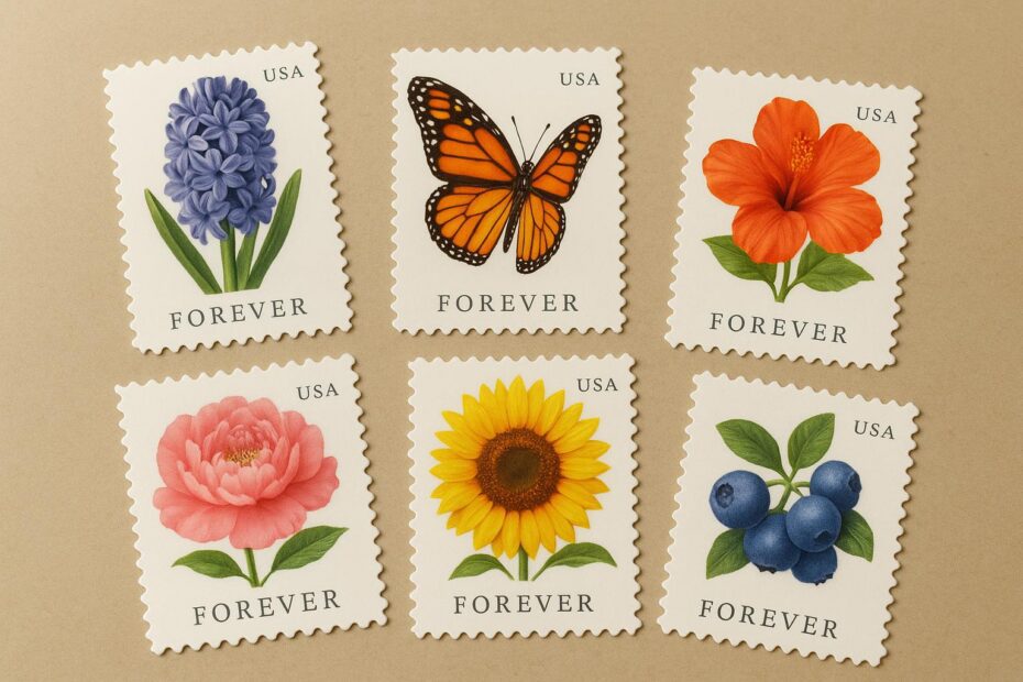
Designers are trimming the excess. Look at recent releases: simplified portraits, bold typography, and single-color backgrounds that make the main subject pop. That pared-back approach is part of bigger forever stamp trends, where clarity and instant recognition matter more than ornate borders. The result reads well at a glance and holds up when reduced to postage size.
#### Scale And Detail
Micro-illustration skills are getting sharper. Artists now plan compositions knowing stamps will be viewed both from arms’ length on a letter and up close on a collector’s page. Fine line work, high-contrast shading, and selective use of negative space let tiny motifs breathe. The trade-off: complex scenes are less common, replaced by focused vignettes that translate better across printing processes.
### Subjects And Storytelling
There’s a clear shift in what we honor. Nature, everyday workers, local landmarks, and cultural milestones show up more often. That reflects stamp design trends emphasizing diverse representation and relevance. A set featuring regional foods, for instance, tells a community story faster than a generic national symbol ever could. Collectors notice that, and casual users notice it too — people tuck those stamps into cards because they say something personal.
#### Typography As Personality
Typefaces are no longer an afterthought. Clean sans-serifs and hand-script accents coexist, giving each issue a voice. When a font matches the imagery — playful strokes for a children’s theme, sturdy capitals for a historical portrait — the entire stamp feels intentional. This focus on lettering ties into stamp design trends that treat text as part of the artwork rather than just a label.
## Materials, Tech, And The Physical Object
Paper and finish choices are changing the tactile experience. Some recent releases use textured stock or matte coatings to reduce glare and emphasize detail. Eco-friendly papers are creeping into production as postal services test sustainable options. Those choices affect both the look and the cost, and they factor into forever stamp trends around durability and environmental messaging.
### Interactive Features Increasingly Common
Remember when stamps were inert squares? Now some issues include scannable elements or augmented-reality features that animate on your phone. QR codes, invisible inks visible under special light, and digital tie-ins allow a single stamp to host a short film or an artist interview. This makes stamps part of a larger narrative ecosystem and gives younger audiences a reason to engage.
## What Collectors And Postal Agencies Are Saying
Collectors appreciate continuity and surprise. Limited runs, pane variations, and first-day covers still drive attention, but agencies are also designing with everyday mailers in mind. That means more thematic series and practical motifs that sell well at post offices. Those production choices reflect ongoing forever stamp trends — stamps that remain valid regardless of future rate increases are now also expected to feel contemporary.
### Market Signals And Design Feedback
Sales data and social sharing guide future issues more than they used to. If a floral series gets traction on social platforms, expect follow-ups that lean into the same palette or illustrative style. Postal services solicit public suggestions, then test popularity through surveys and pilot prints. That loop accelerates certain stamp design trends, making visual vocabularies repeatable across years.
## Small Changes With Big Impact
A color tweak or a tighter crop can change how a stamp reads in a collection or on a package. Because stamps are scaled-down canvases, every decision is amplified. The new stamp designs this year are less likely to be ornate commemorations and more likely to be efficient communicators: clear subject, readable text, and a design that performs under multiple lighting and reproduction conditions. That practicality has reshaped expectations.
### Design Lessons Other Small-Format Projects Can Steal
If you work with icons or product labels, take note. The principles behind recent stamps apply elsewhere: emphasize contrast, limit elements, and make sure typography carries meaning. Stamps teach designers to prioritize legibility and storytelling in tight spaces. Apply those lessons, and small surfaces start to feel deliberate rather than cluttered.
## Where This Moves Next
Expect bolder color blocks, more portrait-driven issues, and continued experimentation with materials. The new stamp designs this year suggest a steady move toward relevance over romance. Postal services want stamps that get used, and designers want them to be worth keeping. That tension fuels creative choices and keeps the hobby interesting.
A few months from now we’ll see which motifs repeat and which were one-off moments. For now, new stamp designs this year are offering a readable, modern take on tradition — not flashy reinvention, but thoughtful evolution. obivously, the small format doesn’t limit ambition; it focuses it.