The first thing to notice is that Forever stamps stopped being just a price tag. They became a canvas, a marketing tool, and a tiny piece of cultural memory. That shift is what the design evolution of forever stamps is mostly about: utility turned into storytelling.
## The Design Evolution Of Forever Stamps As Visual Currency
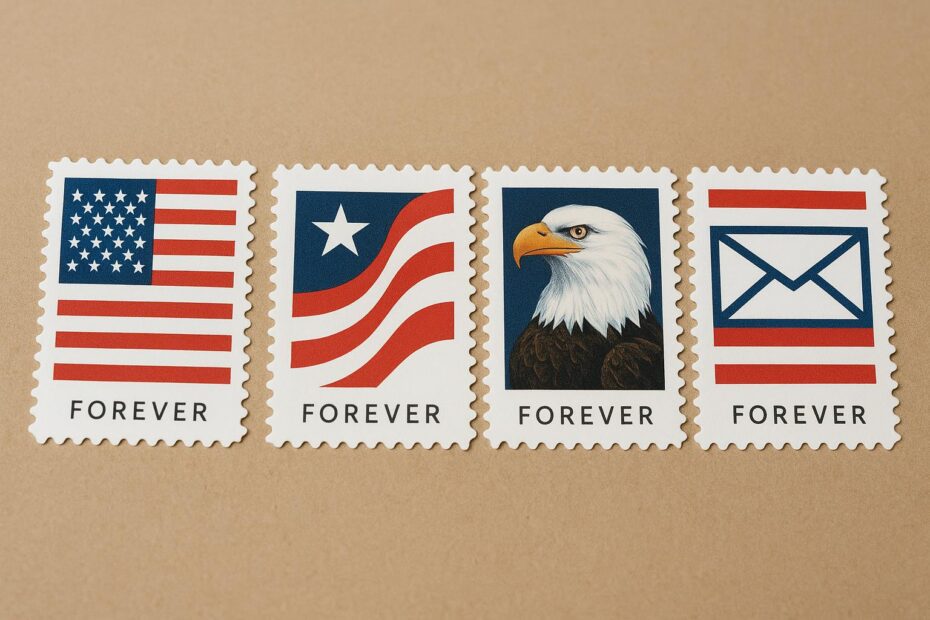
When the USPS introduced the first Forever stamps in 2007, the point was simple: buy it once and it covers future first-class postage. What nobody predicted was how that practical idea would push design in new directions. Collectors and everyday users alike started treating these non-denominated stamps as things to keep, display, and talk about. So designers stopped thinking only about denomination placement and started thinking about impact.
### How Function Drove Early Changes
At first, forever stamp evolution leaned on existing production methods. Designers worked within the constraints of stamp size, printing plates, and traditional gummed backing versus self-adhesive. The switch to self-adhesive sheets made it easier to use more delicate art—thin lines and subtle color gradations that would have peeled with older gum. That change matters: if a design will be on envelopes and refrigerators instead of just glued inside albums, it has to stand up to handling and still look good.
### Materials And Printing Matter
Advances in printing technology nudged the stamp evolution forward. Digital and offset techniques allowed for richer photo reproduction and fine halftones. Photographic images became viable at stamp scale without looking muddy. Variable-data printing made it possible to produce small-run issues with unique elements. You can see this in themed series that incorporate slight differences across a pane, creating small variations that collectors chase.
## Designers Using Stamps To Tell Stories
Designers began treating each issue like a short essay. Instead of a portrait floating in the center, stamps started to layer context: background textures, appliances of typographic choices, and tiny graphical cues that hint at time and place. That narrative approach is a big piece of the design evolution of forever stamps.
### Subjects Shifted Toward The Familiar And The Unexpected
You’ll find political figures and national symbols, yes. But you’ll also find pop culture icons, endangered species, regional foods, and scenes from everyday life. That breadth reflects two things: postal services wanting to sell more stamps, and designers wanting to reach beyond stamp collectors to people who might buy a stamp because it resonates with them personally.
#### Commemorative And Definitive Blends
Forever stamp evolution also blurred the line between commemorative art and definitive, everyday issues. Long-running definitive series used to be functional and highly stylized. Now, designers borrow that seriousness and apply it to limited editions, while keeping a look that fits among regular-issue stamps. The result is a visual language that keeps changing but stays coherent.
## The Role Of Culture And Commerce
Design doesn’t happen in a vacuum. The stamp evolution reflects broader trends: political attention to diversity, interest in sustainability, and nostalgia cycles. Consider the way floral or wildlife themes align with a growing environmental conversation. Or how popular media tie-ins capitalize on fandoms. These choices aren’t random—postal services need sales, and designers know which images stick.
### Collector Influence And Community Feedback
Collectors talk a lot, online and at fairs. That chatter influences what gets printed. Small print runs that sell out create a pattern: if a design sells, you can expect similar approaches later. The forever stamp evolution feeds on this feedback loop. Designers experiment, collectors react, and postal services adjust.
#### Testing New Ideas In Small Batches
One practical route has been issuing small thematic runs to test reception. If a design concept works—say, a multi-stamp pane with a single panoramic scene—postal authorities will scale it up. These experiments let designers push typographic treatments and unusual formats without committing to massive runs.
## Design Details That Changed Perception
Look closely and you’ll spot the nuts and bolts of the change. Typefaces grew bolder and more varied. Color palettes expanded beyond conservative blues and greens to include saturated oranges and deep teals. Edge treatments moved from plain perforations to die-cut shapes that integrate with the artwork. Such decisions make a stamp feel less like a bureaucratic artifact and more like collectible art.
### Typography As Identity
A lot of the narrative weight rests on type. The choice of a humanist sans over a formal serif can instantly shift tone. Designers use type to set the mood: friendly, solemn, playful, or reverent. That’s a small detail that matters because words on a postage stamp are often the only text people see when they glance at an envelope.
### Scale And Composition Tricks
Scaling elements so that small details occupy most of the frame is another tactic. Close-cropped portraits, overscaled florals, and bold negative space make stamps readable at glance and striking when grouped. It’s a visual trick that marks recent stamp evolution and keeps newer issues from feeling generic.
## International Threads And Comparisons
The design evolution of forever stamps in one country mirrors movements in others. Non-denominated postage exists in several postal systems now, and designers learn from each other. Exchanges at exhibitions and international stamp shows accelerate ideas: a clever die-cut in one country soon shows up as inspiration elsewhere. That cross-pollination keeps the conversation lively.
### Technology, Security, And Digital Interactivity
While aesthetics have taken center stage, security features and digital tie-ins have grown too. Microprinting, specialized inks, and subtle embossing protect value, while QR codes and AR experiments connect the tactile with online content. These features change how people interact with stamps, making them gateways to stories rather than static pictures.
There are missteps along the way. Designs that try to do too much can feel crowded, and trendy motifs can age quickly. Still, the broad arc is clear. The design evolution of forever stamps has transformed a small piece of paper into a meaningful cultural artifact.
## Looking At The Next Steps In Stamp Design
What’s next in the forever stamp evolution? Expect more cross-media collaborations, deeper use of variable printing, and continued attention to themes that reflect social priorities. The stamp evolution will keep balancing commerce and culture, with designers pushing toward images that resonate in living rooms as much as in albums.
### A Final Example To Watch
Keep an eye on multi-stamp panoramas and augmented experiences that tie the physical stamp to an online story. Those formats take advantage of the forever concept—people keep stamps, so adding narrative layers can pay off over time.